Table of Contents
Hide
What is Visual content marketing?
Generally speaking, visual content marketing involves using visual content, such as images, videos, and GIFs, to convey information to your audience. The modern belief obviously is contrary to the old popular belief. In the past, SEO was all about getting higher rankings by using all text or partial pictures. This old-school strategy no longer works. Nowadays, we reckon that visual content marketing is not only about sharing complete words, pretty pictures, and infographics, but about understanding how the human brain processes visuals, and leveraging that information to boost your content marketing efforts. In doing so, a kind of emotional connection, or perhaps marketing engagement may be built and then it may further boost your sales.
Why do most businesses attach great importance to content marketing strategy?
According to statistics, we tend to retain visual information for much longer than plain text or auditory information. It is because visuals have been proven to improve learning and comprehension, and increase the motivation to take action and consume additional content. There are also some statistical reasons from the website dreamgrow that may better explain why content marketing strategy is so important.
-
Almost 90 percent of information conveyed in the human brain in a visual manner.
-
Information presented in the visual form is more impressive in the brain compared with the form of texts.
-
With the aid of visuals, social networks are more likely to win more likes, shares, and retweets, and websites have higher rankings.
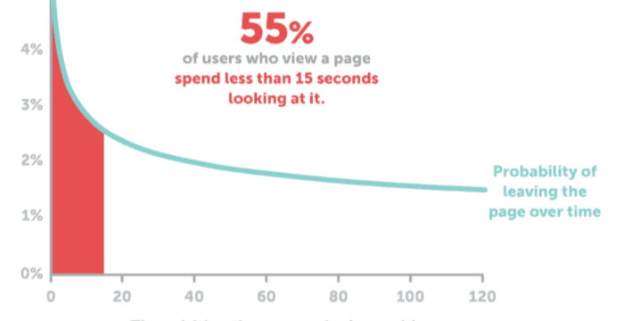
Moreover, you may directly realize the importance of visual contents through the below picture extracted from dreamgrow, a website related to visual content marketing. The information that the following picture wants to convey is that 55% of users browse a page within 15 seconds. So you must impress your viewers under the limit of the 15 valuable seconds. Here is the question now. How do you attract your viewers to continue to read during the time limit?
How to get visitors to stay longer on your website within 15 seconds?
As mentioned above, we realize that visual content marketing strategy is apparently useful. But how should we apply the marketing strategy to our websites and enable them to productive? The following description aims to give you some advice on how to get visitors to stay longer on your website. Despite the fact that visuals include many factors, such as images, infographics, video memes or gifs, the article focuses on the subject of images. To be specific, there are some rules already recognized by some major websites that usually have higher rankings.
Step 1: Upload a proper featured image.
A featured image is necessary for you to attract more newcomers, but you should make sure its position on your post is correct. A featured picture usually is the big picture placed at the top of your post. It is no exaggeration to say that it, more or less, stands for the center of the article. So it should be highly related with the topic of the article. My suggestion is that using the final outcome perhaps can be regarded as your featured picture. For example, if your company is engaging in processing pictures by offering users convenient software, then isn’t it a good idea for you to use the processed picture as your featured picture? You might as well see the following featured images and experience them in person.
-
Posts with featured images
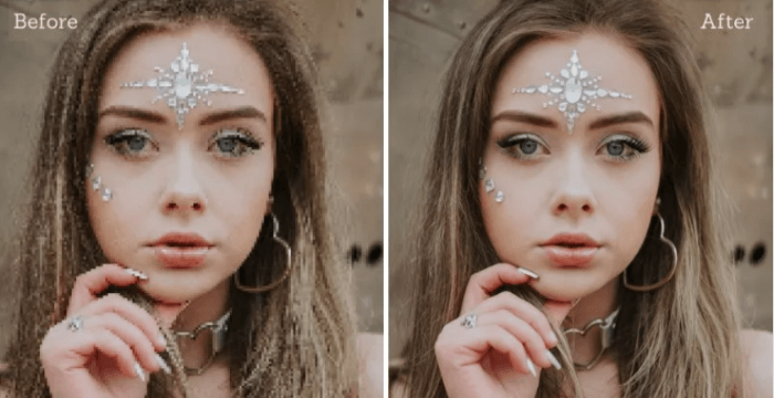
This picture is extracted from How to Depixelate Image with AI in 3 Steps, and it obviously is made as a featured image. Choosing this image is an authoritative example as it is listed as a popular post on VanceAI. Hence, you can directly discern the differences between the original picture and the processed one by the tool. And words like Image Depixelated by VanceAI pasted on the picture help you immediately realize what happened to the picture.

Another example also comes from a competitive website (https://www.topazlabs.com/learn/what-shutter-speed-to-use). It is not difficult to notice that it also begins with a featured picture. Of course, there are no descriptive words on it, which also ensures it being clear and tidy on the other hand. So, a featured image is needed but words are not. Still, let’s come around to the topic of 15 seconds. From the perspective of visual content marketing strategy, I cannot make certain that your pure words can keep your visitors watching them for 15 seconds, yet it seems not very difficult to do that with a beautiful image.
-
Posts without featured images
On the contrary, it is not rare to see many posts with too many words when you browse the blog of the website. Even if some visitors may stand the test of words, they tend to quit when words still find them in the next chapter.
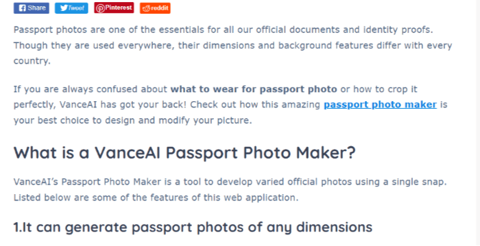
Therefore, it is not too late for you to upload a featured image to beautify your post. Compared with the post with lots of words, your new post is bound to be more popular.
Step 2: Choosing unique but not weird images for your content.
This part will start with some counterexamples. The examples will explain why they are weird.
This one is a little dark or evil, which warns us that the pictures giving readers uncomfortable feelings should be avoided. For this one, does it remind you of some kind of happy or delightful things?
-
Negative examples.
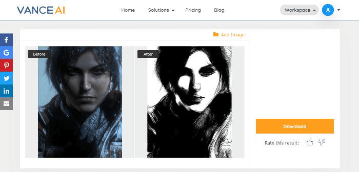
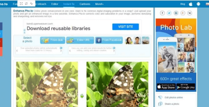
Or the picture below should also avoided not only because of the hardly recognized creature, but of the untidy elements around the interface. That is because it is likely to confuse users. Moreover, during such a situation where you review more than five products, you must not list them in your content mechanically. In contrast, what you need to do is show their actual effects one by one by using the same picture. The power of a small picture cannot be ignored. Different effects appear when the picture is processed by some products. So your picture is the direction which leads readers to the end of your article. More importantly, after reading your post, users really have solved their problems and known which one is suitable for them, instead of a sense of being fooled.
-
Positive examples.
As this picture has acquired more traffic, it can be used as a fine example for practicing the strategy of visual marketing. If you want to keep visitors longer on your website, you should use stunning and clear pictures.
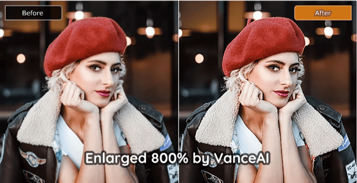
As mentioned above, dark or dim pictures often are not encouraged. The picture below is actually a good example of bright color. It is also full of contrasts, as seen between the upper bright part and the dark part below.

Conclusion:
From the statistics and examples above, visual content marketing strategy is definitely useful for businesses. And visuals are an integral part of content marketing. As for how to use visual images to produce real effects for your websites, however, few people give an accurate answer. This article also does not give you a one-size-fits-all solution on the one hand; on the other hand, it just provides you with some sound advice by learning from the lessons about visual content other websites have acquired so as to help you.
